In the digital landscape of 2026, user attention is the most valuable currency. As applications become more powerful and data-dense, the challenge for designers has shifted from “what features to include” to “how to display them without overwhelming the user.” A persistent user interface (UI) must remain functional and accessible across long sessions, yet it must not succumb to the visual noise that plagues modern software.
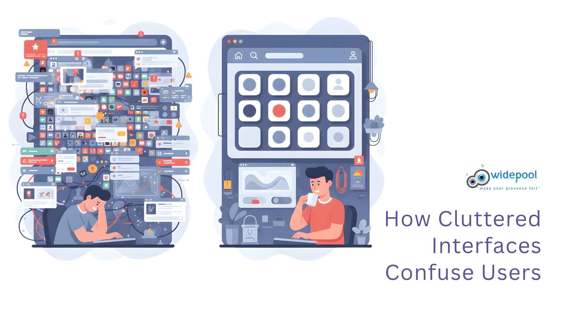
The goal of a modern, persistent UI is to provide constant access to essential tools without creating a chaotic environment. When users feel “lost in the menu,” engagement drops and bounce rates skyrocket. By applying principles of Cognitive Load Theory and intentional visual hierarchy, you can create interfaces that feel both powerful and effortlessly clean.
Understanding Cognitive Load in Modern UI
Cognitive Load Theory suggests that our working memory has a limited capacity. When an interface forces a user to process irrelevant information, their ability to perform primary tasks diminishes. In 2026, the best interfaces are those that act as “invisible assistants,” prioritizing the user’s immediate intent over the full breadth of available features.
To reduce mental effort, designers must embrace progressive disclosure. This design pattern involves showing only the most critical information upfront, while hiding advanced options in secondary menus or context-aware tooltips. By limiting the number of elements visible at any given second, you keep the user’s focus sharp and their frustration levels low.
Strategies for Simplifying Complex Interfaces
Reducing UI clutter isn’t just about deleting buttons; it is about organizing logic. A persistent interface should feel like a well-structured workspace rather than a junk drawer.
1. Leverage Strategic White Space
White space—or “negative space”—is the most effective tool in a designer’s arsenal. It provides a visual breathing room that allows users to scan the screen naturally. In high-density dashboards, use generous padding and consistent margins to separate distinct functional blocks, preventing the “wall of text” effect.
2. Implement Context-Aware Toolbars
Instead of keeping every possible action visible at all times, transition toward contextual UI. If a user selects a block of text, show formatting options only then. If they are navigating a map, hide the file management tools. This keeps the interface feeling “persistent” because the navigation remains, but the content adapts to the current task.

3. Establish a Strict Visual Hierarchy
Use size, color, and weight to dictate the importance of elements. If everything on the screen is “loud” (bold, bright, or large), then nothing is important. By reserving high-contrast colors for primary calls-to-action (CTAs) and using neutral tones for secondary controls, you guide the user’s eye exactly where it needs to go.
The Role of Motion in Persistent Design
In 2026, motion is no longer just for aesthetics; it is a functional tool for UI clarity. When a user navigates between states, subtle transitions—like fading, sliding, or scaling—provide spatial context. This helps the user understand where they are in the application architecture, reducing the disorientation that often leads to a feeling of clutter.
However, avoid excessive animation. Motion should be purposeful and fast, reinforcing the user’s action rather than distracting from it. If a transition takes longer than 300ms, it risks feeling like a laggy, cluttered experience.

Best Practices for Long-Term User Retention
A persistent UI must also be customizable. What is “essential” for a power user is “clutter” for a beginner. Providing users with the ability to toggle sidebar visibility, reorder widgets, or switch between “Compact” and “Comfortable” display modes can drastically improve satisfaction.
- Prioritize Accessibility: Ensure that your clean design doesn’t sacrifice readability. Use high-contrast ratios and scalable typography.
- Consistency is Key: Use a standardized design system across all screens. If a “save” button looks different in one corner than it does in another, you create unnecessary cognitive friction.
- Test with Real Users: Use heatmaps and eye-tracking tools to see where users get stuck. If a specific section of your persistent UI is never clicked, it is likely clutter and should be removed or moved to a secondary menu.
Conclusion: Designing for Clarity in 2026
The secret to designing persistent user interfaces that don’t feel cluttered lies in restraint. By focusing on the user’s primary journey and stripping away the “nice-to-have” features that distract from the main goal, you create a space that feels calm, professional, and highly efficient.
As we move deeper into 2026, remember that the most successful interfaces are those that empower the user without demanding their constant attention. Keep it simple, keep it functional, and always put the user’s mental bandwidth at the center of your design process.